
No wait, I’ve got it. What disturbs me most is that anyone thought this was worth making and putting on television.
Friday, July 30, 2010
WTF Week 2: Double lame bros
Thursday, July 29, 2010
WTF Week 2: Sh*t E


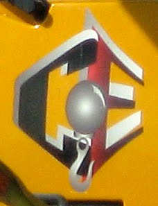
Maybe it’s not nice to pick on Earth Day. After all, it’s a fine and decent day. But since when do we need to flash a gang sign to show we’re “committed to preserving and protecting our Earth’s precious resources”?
Maybe I’m just not as cool as Deepak Chopra. Fine. I can live with that. But at least I get that if “showing the E” is supposed to catch on, then maybe the drawing of the hand signal should match the actual hand signal. Otherwise you’re just hailing a taxi with 3 fingers.
Wednesday, July 28, 2010
WTF Week 2: Time for a Cex change

In case you don’t know what these guys do, and because there’s absolutely no way to tell from this logo, here’s a link to their website.
Now that you know what they do (and even if you didn’t bother to look, because really, there’s no scenario on earth that would make this alright), try not to get a sprain in your neck from shaking your head in bewilderment.
Tuesday, July 27, 2010
WTF Week 2: Shadow barfing


Last I checked, the Tony Awards are a pretty big deal. At least big enough to warrant some decent design work. It’s that “They should have known better” component that really catapults this into WTF status.
Let’s just assume for one minute that the word TONY could spell out the word AWARDS with its shadow, I still have two big questions. 1) What the hell is that shadow being cast upon? And 2) Why does it look like a drunken chimp drew it?
Monday, July 26, 2010
WTF Week 2: Sh*t canned
Once again, I find myself with a stack of images that need some special, singular attention. These things are just so uniquely bad, their insanity/stupidity/vulgarity has left me unable to find suitable counterparts for them. And since WTF Week seemed to be well received, and summer is the time for sequels, I give you WTF Week 2.


I mentioned these things are really bad, right? In fact, this is so bad I don’t even have the energy to list all of its transgressions. Let’s just say, if you were to throw a dart at this blindfolded, you would safely hit a design element worth scrubbing from your mind. Come to think of it, that blindfold is sounding mighty good right about now.
Friday, July 23, 2010
Murad and Bikini Zone


Pr*tty
Once again, Helvetica is awesome. But I also like the M mark because it resembles a shtickl of lotion. It’s satisfying in the same way that those make-up spreads in fashion magazines—you know, with the puddles of nail polish and crumbled piles of eye shadow—are. Right ladies?
Sh*tty
Never has this particular zone been so unappealing. But hey, who needs to instill confidence in the buyers with a professional and credible looking design. It’s not like you’re gonna rub it on/near your lady business, or something.
Thursday, July 22, 2010
Hand writing: Where The Wild Things Are and Havaianas


Pr*tty
I realize it’s not exactly topical to show a movie poster this old, but I just want to point out that I appreciate it when lettering is supposed to look hand written, and it is.
Sh*tty
Conversely, when it’s supposed to look had written and it isn’t I just get annoyed. Seriously, is it so hard to write these headlines out by hand? If you’re allergic to ink and pencil lead, or something, get yourself a f*cking Wacom tablet—we have the technology, people!
Wednesday, July 21, 2010
Wednesday Waffler: Five Star Carting

There’s plenty about this that a design snob like me could hate. But I can’t help but find that hand-painted lettering impressive. And I think it’s nice to see a garbage truck exude such pride and (questionable?) charm.
Thanks to P*S* reader Matt Convente for sending the image.
Tuesday, July 20, 2010
Zipcar and Connect by Hertz


Pr*tty
It’s safe to say I don’t love this to pieces. It’s just OK. But I’m happy to give Zipcar kudos for making a good idea work, and then putting out ads that communicate pretty well what makes it a good idea in the first place.
Sh*tty
Now we watch as the big guys scramble to keep up with the good idea. Sorry Hertz, no amount of copying from the smart guy’s homework is gonna get you that A+ your mommy is hoping to tack to the fridge.
Thanks to P*S* reader Brett Essler for suggesting these.
Sunday, July 18, 2010
Kettlecorn: Popcorn, Indiana and Ike & Sam's


Pr*tty
I don’t like kettlecorn, but I bought a few bags of this to replace those scratchy throw pillows my wife bought for our couch.
Sh*tty
This was once a Waffler, and I do still kind of like the little guys, but holy what the ugly else is going on here? If I were to open this bag and vaporized cayenne pepper spices were to fly into my eyes, and I was temporarily blinded, it would be a welcome relief.
Monday, July 12, 2010
5 Simple Ways to Design a Great Logotype
We’ve all been there, that anxiety-ridden moment when you realize, the day before your client meeting, that you don’t yet have any logo design ideas to show them. Maybe it’s a creative block, or a shortage of manpower or time. Whatever the reason, you’re in a pinch, and you need to come up with something fast.*


First things first, forget about trying to make a custom icon or mark—there’s no time for fine tuning something like that.
The safest bet is to stick with typography, and hey, who doesn’t love typography? But rather than go through the same old exercise of trying out the name of the company in every font on your computer, I’m going to share with you some things I’ve observed in all my “harvesting” for this blog. These are 5 really simple ways to make a great looking logotype.
Holding shapes!


This should come as no surprise to anyone who’s spent any time reading this blog. I have a total weakness for holding shapes. Of course, some thought and effort has to go into just what shape to use, but sometimes all you need is a good clean square or circle (see Osso Buco below).
But, like everything on this list, it can go wrong. Horribly, stomach crampingly wrong:

Arc de triomphe


I’m sure the type purists just sprayed corn flakes all over their iPads, but I can’t help but love the way this looks. Sometimes it even works from the top.
But I’m pretty sure the secret is boxing it in on at least three sides. Don’t get greedy!

Reverse Prismatics


Most of time, you see this sort of thing not as a faux-dimensional effect, but when letters are actually cut into stone. By reversing the effect, the letters appear to project outward. I find it adds some character and weight to the type, without getting into gradients and other such nonsense.
And if the illusion of depth isn’t enough for you, then just go for the real thing:

I have to say, even when it’s bad, it’s still pretty good.

Go Condensed


Regular readers will probably know that I have a certain affection for bold, condensed, sans-serif typefaces. I’m not sure what to attribute this preference to. I grew up drinking orange juice from concentrate, and am still to this day one of those weird people who prefer it that way (it’s certainly less to carry home from the store!). Maybe it’s similar to that.
But just so we’re clear, it ain’t foolproof. Oy vey!

Customize an Apostrophe


Needless to say, this only works when you have an apostrophe in the name. And if you do, it’s a nice, subtle way of giving otherwise unassuming typography an extra layer of meaning and own-ability. (And of course it doesn’t hurt if the type has some character of its own, too.)
Does it always work? Of course not:

* Getting things done quickly is sometimes a necessity, but not one I recommend. I am by NO means giving anyone permission to be lazy. These solutions are simple, but do require some care, thought, and finesse.
Friday, July 9, 2010
Hooper's and Max Brenner


Pr*tty
Not unlike my reaction to those who don’t like chocolate, anyone who doesn’t adore this sign, I just have to think you’re weird and wrong.
Sh*tty
The drawing of the face I can almost tolerate, even if it leaves me thinking, “So what?” But the utterly atrocious MB scrawl and bizarre choice of Bank Gothic have me convinced he’s more a bad man than a bald one.
Thursday, July 8, 2010
Window displays: Paragon Sporting Goods and City Sports


Pr*tty
This, for me, is sort of like a Christmas tree. The sneakers are mostly tacky ornaments, but the overall, collective effect is quite festive.
Sh*tty
So you’re probably thinking since I compared the first one to a Christmas tree, that this one must be the crèche. Which would make Mary and Joseph headless bike messengers, and the baby Jesus the World Cup soccer ball whose suspect design has all the losers whining in their foreign equivalent to Wheaties. But no. It’s just an ugly, chaotic window display. Also, headless Joseph is wearing basketball(?!) sneakers.
Wednesday, July 7, 2010
Honda and Yamaha


Pr*tty
That wing mark has well-drawn, clean lines and an engaging, dynamic shape. If you ever needed proof that a logo doesn’t need to be a wholly original idea to be own-able and iconic, this is it.
Sh*tty
This trio of tuning forks has the best of intentions. Which is to say, it’s a fine concept, and convenient that a tuning fork looks like the letter Y. But the three of them overlapping inside that circle look jumbled and clumsy. Also, someone took the logo to Gradient Town for a wild night out, and left it passed out on the floor beside the out-of-order Frogger machine.
Tuesday, July 6, 2010
Bay Crane and Cranes Express


Pr*tty
This is exactly the sort of thing this blog was intended for. Who would think to find such a simple and handsome typographic execution on the front of a big industrial crane? The crane is a pretty cool piece of machinery in and of itself, too. But when I took this picture, I never thought I’d find a counterpart for it.
Sh*tty
So it was a nice surprise to have this in the opposing lane as I sat in traffic this holiday weekend. A sweet looking crane, but with a bizarre and terrible logo mucking up its front end. A good reminder to keep my camera nearby!
Friday, July 2, 2010
235 Park Ave. South and 160 Third Ave.


Pr*tty
Not only are these numerals sweet as can be, but the fact that each one fits squarely on its own panel of the stone fascia demonstrates some real thought at work. Man, these are great.
Sh*tty
If you’ve ever wondered where asian stereotypes from the cartoons and movies of the early 20th Century retired to, now you know. I like to imagine Mr. Wong is the doorman here. Ask nicely and he’ll sell you a mogwai, and a monkey paw to wish on.
Thursday, July 1, 2010
Door Store Furniture


Pr*tty
So here’s what’s on the window at this store. I assume it’s an older logo that was never replaced when they adopted their current design...
Sh*tty
... which is this bit of typographic malignancy. Who gives up the former for the latter? Who!? The same folks who named their furniture store the Door Store, I guess.
Subscribe to:
Posts (Atom)

