Friday, April 30, 2010

105 Fifth Avenue and 53 West 23rd Street

Pr*tty
I love it when a building’s address sign really responds to the architecture. Kudos to the designer for convincing the client to do something really dynamic and interesting with these three numbers above the door.

Sh*tty
You might notice the door is slightly ajar here. That’s caused by the giant vacuum of suck that is the cheap, plastic numerals right above the entrance. Cross that threshold quickly, or risk getting sucked into oblivion yourself.

Thursday, April 29, 2010

A Nightmare on Elm Street and The Karate Kid

This post is not a commentary on the merit of remakes, nor is it a commentary on the merits of the respective genres these movies are part of. I’m simply responding to the design of these “standees” (yes, that’s what they’re called).

Pr*tty
Anyone who was both terrified and exhilarated by the original film, is likely to get goosebumps seeing this at the end of a dimly lit corridor at the movie theater. With only two simple layers and a light, it is every bit as chillingly iconic as it should be.

Sh*tty
Also highly referential to the imagery of the original, but with a design by the year book committee from Elmhurst Junior High School. Thanks for bringing those soon-to-be memories to life, kids.

Wednesday, April 28, 2010

Saturation Point: Commuting references

A couple weeks ago I posted a pair of images that used design motifs from the mass transit system. Those images, along with the following 4 (3 of which I took in the last week) have got me thinking enough is enough.

A bit of advice to all you copy writers out there: There’s nothing unique, or clever, or particularly compelling about ads that play off of the commuting experience. So please, find some other themes to work with.

First of all, no. It’s rice. It can’t be in a bigger hurry than me. Secondly, your Photoshop license has been revoked. How much did you charge the poor Minute Rice people for that one-click motion blur bullsh*t?


Saw this on the bus. It might work better when people are standing and have their hands up to hold on, but it’s still lazy writing. And when everyone is sitting (which is often) this ad fails in every possible way.

Saw this outside the window of that same bus (which is why the image quality is so bad, sorry). Thanks for the reminder that my commute is long, assholes.


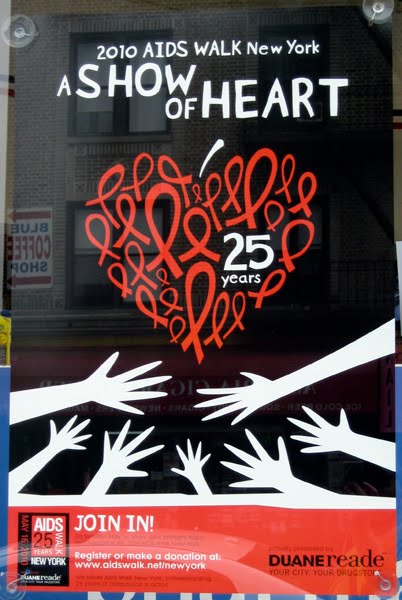
This is the only one I’m inclined to give a pass to. For one thing, it’s part of a larger campaign that uses the fill-in-the-blanks technique fairly successfully. Also, the writing may make reference to the trains, but it does so in a perfectly legitimate and persuasive way.

That said, I’ve still seen enough.

Don’t make me come by your ad agency office and post ads for the MTA that make reference to your job. How’s this?: The MTA. Don’t worry, we work harder than you do. Or this?: The MTA. Our trains and buses have seats perfect for lazy asses like yours.

You’ve been warned.

Tuesday, April 27, 2010

Uniqlo and Celebrity Pink Jeans

Pr*tty
Stylish and compelling. When you see this, there’s that brief moment - just a nanosecond - when the U and the J read as pure, abstract geometry, then a nanosecond later read as the letterforms they are. I could comfortably live in that first nanosecond for a few weeks at least.

Sh*tty
Here’s a reader contribution that I’ve been holding onto for months, just waiting for the right counterpart to appear. It’s a real shame I had to wait so long to show it too, because wow, is it awful. I’ve seen a lot of bad ligatures in my time, but this is among the most stupid ever made. Also, that typeface is criminal.

Any guesses what a Celebritu is? Leave a comment. The most entertaining definition gets a prize.

The sh*tty image was supplied by my pal Domenic Pagaliluan. Thanks D!

Monday, April 26, 2010

Milwaukee and Ryobi


Pr*tty
This logo is simply awesome. Like brand-new-bicycle-for-your-twelfth-birthday awesome.

Sh*tty
It might be a bit harsh to say this is sh*tty. But I can’t shake the feeling  that this identity doesn’t feel right for power tools. It’s as if I’d open the box and find a hollow, cheap, plastic toy version of a power tool inside instead. Or a calculator watch from 1983.

An interview with yours truly

A nice fellow from Boston, named Jason Stevens, asked me to participate in a micro-interview, as part of a series he’s conducting with designers of all sorts. The project is called Small Talk: 3 or 4 Questions to 150 Designers. You can see our Q & A here.

If anyone has any thoughts about other interesting new designers Jason should contact, please leave a comment and I’ll make sure he sees it.

Thursday, April 15, 2010

Hale and Hearty and Soup Man


Pr*tty
A fun name, and some fun but simple typography. If you don’t like this, then please place your first two fingers upon your neck and check for a pulse. (The design is by Memo Productions, by the way.)

Sh*tty
This is some lazy sh*t. Just look at the name, first of all. Then there’s that O in the word Soup. Maybe it’s just me, but replacing an O with an icon of what it is a business sells or makes or offers (especially when that thing is O-shaped), is a big, bright warning sign that a designer might lack any real imagination.

Also, fires go under cauldrons, not inside them.

Wednesday, April 14, 2010

Wednesday Waffler: AIDS Walk New York


This poster has an eye-catching simplicity that I appreciate. But after the first glance I can’t help but think it’s a huge pile of mixed metaphors. The ribbon itself is symbolic of something. Layer in a classic heart shape... OK, not bad. Then add a stem to make it a Big Apple... now you’re pushing it. And I guess the hands represent people joining in, but last I checked, an AIDS walk is more about feet.

A couple links

Designer and illustrator Chris Piascik took a quote of mine from my interview with Paula Scher and did some nice hand-lettering with it. Check it out.

And somewhat related to my interview with Paula, blogger Chris Bowden recently did an interview with Paula’s Pentagram partner (and my former boss) Michael Bierut, over on his blog Facing Sideways. Go there.

That is all.

Monday, April 5, 2010

CFLs and Minute Rice

The iconography of the NYC subway system is often imitated or referenced in design and advertising found throughout the city, especially campaigns meant specifically for the subway. Sometimes it works, other times not so much.


Pr*tty
Awkward overlapping headline typography aside, the drawing of the light bulb as the subway map is quite nice, and properly utilizes the vernacular of the existing map design.

Sh*tty
I’ve read far worse headlines than this, but instead of letting the writing carry the weight, they add in a half-hearted subway motif that feels entirely wrong, and also looks pretty ugly. The rice may only take a minute, but the sh*ttiness stays with you for a lifetime (or maybe like an hour or two).