Today’s post is a significant diversion from the regular format, and one I am very pleased to be taking because today I’m sharing my interview with Pentagram partner, and design legend, Paula Scher.
For anyone who needs a little background on Paula you can see her bio here and here.
I want to thank Paula for doing this. It was great fun, and very insightful. And without further ado...
Pr*tty Sh*tty is about “everyday” design. What everyday designs are you responsible for? Anything out there that might surprise us?A few years back, my team and I did the packaging for Pro-Foot, a series of products that sit in blister packs (yellow and green backgrounds) in Target, CVS, Walmart, etc. They sell products for things like toe fungus, and go head-to-head with Dr. Scholl’s who owns the category. It’s about as “everyday” as you can get. We also recently redesigned Renu, a contact lens solution for Bausch and Lomb, as well as their identity, and now, all their pharmaceutical products, which will be out in the late spring. Last year we designed, the packaging for Truvia, a sweetener made from the Stevia plant that was developed by the Coca-Cola Company and Cargill in a joint venture.

 You’ve also done work for some of the great cultural institutions in NYC. Is there anything different about your approach for these types of clients? Any sort of high art/low art distinction in your thinking about, or execution of, the work?
There are the “high” and “low” graphic expectations of the clients. If you look at contact lens solutions, they all have swirly blue stuff on the package that, I think, is supposed to represent water. Cough syrup has the same swirls on the packages, except they’re red. It’s very difficult to get clients in this arena to feel comfortable with change. There is so much at risk. They are terrified of losing customers. Mostly, you can get them to change incrementally. My packaging for Renu was incremental, not radical, but it was a huge improvement and elevated the category.

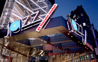
I have designed identities for almost every constituent of Lincoln Center: Jazz, Metropolitan Opera, New York City Ballet, New York Philharmonic. There are the same kind of expectations from these clients within their own milieu. They are really afraid of being too different from one another. There is a certain fear of being too smart, or too populist, or too radical, or too conservative, or really too anything that’s very different from their counterparts. They are very, very conservative when talking to donors, and downright huckster-ish when they are trying to sell seats. In all instances, when designing their identities, I’ve found that I end up creating some vehicle that is a differentiator, and then find a methodology that allows them to maintain some consistency (always the weakest link because it is dependent on them hiring a good in-house department and listening to them). In the end I would say that I wind up making the same incremental improvement in that milieu as I made for Renu, only I think the Renu improvement is more valuable because that arena is so depressing. People
have to buy contact lens solution, and any improvement is a victory.
My most radical work for a cultural institution was for the Public Theater. When I first redesigned it the nineties, it really changed a milieu. That was a rare opportunity that I hope I have again sometime with someone else.

 So, do you think clients like Bausch & Lomb come to you thinking they’ll get a fresher variation on their usual blue swirls. Or do they come to you knowing you’re going to push them toward a new, elevated aesthetic?
I don’t think companies think like that. I think they go to people they know, or have heard of, and assume they have the expertise to do a good job for them. The person who recommended me to Bausch and Lomb was a strategist named Fran Gormley who I had worked with previously at Citibank. She liked working with me and thought she got a good result then, so she recommended me to B+L.
 Sticking with the theme of the blog… any recent examples of “pr*tty” design from your everyday experience that come to mind? Anything you’ve seen that’s made you wish you had done it?
Right at this minute, I am drawing a blank. I think this has been a bad year for design, in general, and I’m not sure what I’m seeing lately. Mostly, I feel like I am witnessing the total abandonment of graphic design. It’s as if the whole industry is yelling out:
WE’RE POOR
WE’RE SCARED and
WE’RE STUPID.
Seems just like the political times we live in, no?
Is it possible what you’re seeing in our industry is just as easily seen in every other industry... simply a symptom of economic uncertainty?
During periods of economic uncertainty, I notice that my junk mail gets incredibly ugly. It happened after 9/11 and it is happening now. Also, billboards and bus shelter signs, as well as newspaper advertising, get really bad. What bothers me most is how ugly the design industry junk mail is, both electronically and in print. I’m talking about mail for design and marketing conferences, or industry news. It’s as if the whole community has decided that promotion is a necessary evil, no point thinking about or wasting time on it, let’s just send out any kind of garbage.
How about “sh*tty” examples from your everyday experience? Anything you’d like to take on as your next big (or small) project?
I’m always ready to take on anything and everything, if the client has an open mind and doesn’t want a repeat performance of something that I did before, or that is already in the marketplace. I love to design, and I am still hoping to do my best work.
Is this conviction to not repeat yourself something you feel every designer should have, or is it simply a personal goal that keeps you motivated?
I can’t make rules for other designers.
Personally, I feel depressed if I don’t think my work is evolving or if I am not making discoveries. I find I tend to work in cycles where I make a personal breakthrough, evolve it for a period of time, get known for it, and then try to abandon it and find something else. Sometimes, when I’ve abandoned something and I try to find something new, I do my worst work. My teacher at Tyler (School of Art), Stanislaw Zagorski, once told me that you have to get worse in order to get better. I think this is true. The period of bad work is always terrible until I figure out the next breakthrough, but I think it’s still preferable to standing still.
I think a lot of people would be surprised to hear you describing some of your work as bad. Would you share an example of something that falls into that category? And is it something you felt was bad at the time, or only in retrospect having arrived at a “breakthrough”?I was really talking about bad periods of work, not individual pieces of design. My “professional” work is rarely “bad”, it’s mostly mediocre or a “B”. That’s because I am too experienced to deliver a terrible job, and I know how to create something appropriate for a given milieu that will function appropriately. There is a
TED talk I gave on this about “serious” work versus “solemn” work. Serious work takes place in extraordinarily rare circumstances. That’s when real breakthroughs are made. Sometimes the breakthroughs aren’t that well crafted because when something is new, it isn’t totally refined. It takes the second or third version of it to get the kinks out. Then it just becomes “solemn” work. For example, I think my early work for the Public Theater was “serious” and my work for the Lincoln Center institutions was “solemn”.


The “bad” work I was referring to is process work that the public never sees. To make change, I try things that are just horrific. Sometimes I feel like I don’t know how to design anymore. I put together techniques and genres that don’t really work. I lose my sense of scale or color, I try things that are awful by any standard. If I’m working on a project with a deadline, I’ll finally abandon the failed experiments and fall back on something I already know how to do (solemn work). You can coast through a career like that, but you won’t grow.
Sometimes amidst the bad stuff I see something in a new way. That’s what I’m looking for.
There are so many relevant design approaches and styles, each with their own distinct merits. How can we be sure what “good” design is? What transcends styles and personal taste and makes design good?I will always argue that the role of good design is to raise the level of expectation of what design can be. That makes what’s “good” different for different milieus and audiences. Style is relevant only in context. I think the question of milieu is the best criteria for judging design.
There’s been a sentiment repeated in recent comments on my blog that the Pr*tty examples I show have a “premium” or “corporate” look. Such comments often go on to argue that the Sh*tty counterparts are intended to appeal to a different demographic, and therefore it’s unfair to compare the two. But I maintain that shitty design is not a means of appropriate communication... that just because people are used to shit, doesn’t mean it should be the acceptable vernacular. Maybe I’m wrong... is there a time and place for bad design?No. What matters is audience and intent. Something can be designed to deliberately look “bad”, i.e. vernacular design. If the intent, purpose and craft (meaning really looking like what it is supposed to look like) is right, then the design is good.
Usually when something is bad, it has nothing to do with the audience. What makes things bad is usually craft and scale issues. Too many big lines of typography, poorly chosen type and bad spacing, or something that is hackneyed attached to the design that was not intended to be a joke. Usually, somewhere along the way, the client asked for something, or it was a stupid recommendation that came out of a poorly run focus test.
Massimo Vignelli often speaks of something like this... the vulgar vs. the beautiful. But I think vulgarity does have an appropriate context. For me “bad” (which I think is rooted in thoughtlessness and carelessness) and “vulgar” are not the same. Would you agree?Yes.
I use a couple quotes of yours to sum up some of my own motivations and philosophy behind this blog. When I contacted you about this interview, you said those quotes were never more true than now. Why is that?Many talented young designers today have abandoned their roles as improvers of the general visual environment. Many only want to work on cultural work, or not-for-profit work, or on projects they perceive as “good-for-society” which may have a high profile within the design milieu, but don’t really reach ordinary people. These designers are afraid to get involved in mainstream packaging, promotion or corporate work. They forget that these are the products and messages that most people really encounter in their daily lives, that these products and services are at the heart of the American condition, and that there is responsibility for us as designers, always, to raise the expectation of what design can be. We are responsible for that daily experience. These “ivory tower designers” leave the job to others (ad agencies, schlock shops, etc.) who are simply doing it for the money, and are often cynical about the outcome.
What do you think has perpetuated that pattern?I think the design community has caused it. The
“First Things First” manifesto inspired a lot of young people to move away from corporate branding, advertising, promotion, packaging (except for books and magazines, as if they are somehow more noble). If “responsible” designers who care about society and our environment refuse to work on branding, advertising, promotion and packaging, then just consider, who will? This line of design-thinking has been perpetuated in so many design schools and grad programs and it is perpetuated by the AIGA and other design organizations. It’s easy to inspire young designers this way as it creates a real calling for them: “down with corporate America”, etc.
But, ultimately, it creates a design society
where it is OK for designers to
abandon most of American communication.
Good God!
Any thoughts about how we re-invigorate the design community to improve our general visual environment?
I’ll do my part. You do yours. I guess blogs like this can help.
Do you think the rhetoric of “responsibility” only serves to perpetuate a view among clients that designers are frivolous creative types whose worth is best tapped via contests, spec work, or (at best) a small payday?
I think clients don’t have any kind of informed, or even general view of designers. Some clients know they need design and don’t know how to hire a designer, and some clients don’t know they need design. Some clients have good taste, some clients don’t. Some clients have graphic recommenders in their midst who are sophisticated. Some clients just want to look like other businesses. Some clients don’t think design should cost anything.
Most of my clients don’t think in terms of “social responsibility”. They think in terms of profit, or if they are a not-for-profit, they think in terms of success, meaning getting people to go to their museums or plays, etc. If a designer is “socially responsible”, that’s nice. The next question is, will it help them sell their products or get people to go to their museums, etc, without costing them anything extra? The answer is, yes, sometimes.
The client’s real responsibility to themselves is to keep themselves going, so they can grow and create wealth, which ultimately means employing people, and contributing to the general economic health of society. We need this. It makes for a better society. I like full employment. Of course they shouldn’t cheat, steal, pollute, etc. But if they are looking for intelligent ways to compete to make their businesses successful, and they are hiring people as result of it, they are heroes in my book.
So have you done your best to only take on those sorts of heroes as clients?
I haven’t really controlled who my clients are. I mostly respond to new business calls that come to me. I started working almost 40 years ago as a record cover designer, and if you trace almost every job that’s come to me personally at Pentagram, you can trace it’s roots, either on subject matter or personal relationships, back to the entertainment business. Even if it’s a corporate client, in some way, they are connected to my roots.

Mostly, I like my clients. I’ve worked for some bright, wonderful people. Others have been exasperating. There have only been a few projects I’ve really had to turn down because of the subject matter, such as cigarettes or right wing political tracts. Almost everything else is fairly neutral. Mostly, I find that my clients work hard, are fair, and care about other people. Ironically, a lot of my worst clients have simply been inconsiderate and, sometimes, incompetent people working for supposed good causes.
And what about in the design community... based on a similar criteria, who have been your heroes there?I say in all honesty, now, that my design heroes are my partners at Pentagram. They run their businesses, they are fair, they keep people employed in rough times, and they care about their work. All of their work.


