Today’s post is a standalone item. It’s sort of one of those things that will just never have a good counterpart, but must be shared.
I mean, seriously? I guess no one at Thomas’ English Muffins knew that offering to make someone breakfast is shorthand for, “I’ll be spending the night... after we do it.” The look on Emeril’s big fat face pretty much says it all.
And who needs that image in their head? Throw in a few of his signature catchphrases and you’ve pretty much seared the optic nerve right out of your mind’s eye.
And yes, I realize this post is basically applying Rule 34 to Emeril. Sorry about that.
Just wanted to let everyone know that I was (not so) recently invited to contribute to the design blog Design Observer, and gladly accepted that invitation.
It took awhile, but I finally found the time to write something to post over there, and it’s published in today’s Observatory section. The piece coincides with the release of the new Pixar movie Cars 2, and offers a slightly tongue-in-cheek critique of the first Cars as a propaganda piece for the neo-Creationist movement known as Intelligent Design.
Let me preface today’s post by stating two things. 1) I don’t drink, so these counterparts have no value judgements rooted in flavor, brand devotion, or severity of hang overs. 2) What fun would this blog be without the occasional controversial pairing?
Pr*tty
I fully acknowledge that this is a pretty crude design. But damn if it isn’t a charming bit of pseudo-Russian alchemy. You just know it’s made in a genuine Ukrainian bath tub.
Sh*tty
Due to my nearly-total lack of knowledge about brands of booze, I pretty much had no idea what kind of alcohol Ketel One was until a few years back. Their notoriously obtuse ads didn’t help much. More damningly, to me anyway, the identity design always bespoke something not vodka. Something more of the European dark ages... a fine, monk-made sherry perhaps.
As a side note, I wonder if any mixologists or molecular gastronomists have tackled the idea of a vodka-popcorn mashup called Ketel Corn.
Certainly the most local of all the rebrandings featured this week. I suspect not many people have heard of Golden Valley Brewery, but a P*S* Reader was kind enough to send them my way, and they fit nicely into this week’s theme.
Old:
New:
The old identity and label design are far from perfect, but they do utilize a degree of simplicity that conjures up a more traditional sensibility appropriate to a microbrew such as this. The GVB monogram in particular, while clumsy, carries some gravitas of establishment... the old school, if you will.
Apparently the new school involves rendering that monogram in a much more dimensional way, which I find very distracting. It draws far too much attention to the G and B being impaled by the V like a couple of vampires. Then they layered in the full name of the brewery, which creates some serious redundancy... apparently no one noticed they already had the name emblazoned across that ribbon on the lower third of the label.
And speaking of the labels, it’s remarkable to me that they have almost identical visual heirarchies, but somehow the newer one is much more muddled. Something about adding the illusion of depth, presumably in an attempt to make things “pop”, really just ends up making it harder to read, I think.
Thanks to P*S* Reader and iPhone user Kristina Franklin, for today’s pairing.
Be like Kristina! Go here to learn more about contributing to the cause. And here to get the P*S* iPhone App.
Here’s a good example of a perfectly serviceable logo being changed to give it more character and ownability. Step One: Make those corners rounded so it’s “friendlier”. Step Two: Do some crazy sh*t with the typography, and make sure only some of the letters look customized to give it that pointless patchwork effect. Step Three: Add a globe, ’cause hey, we’re global, and that’s unique, right?
I really don’t have much to say about either one of these. Neither was, nor is capable of engendering any sort of deep-rooted, fondly-felt brand loyalty. Which is a shame, considering chocolate chip cookies (even crumbly, sh*tty ones like these) are one of those things that we should store up tons of sentimentality about starting at an early age. It’s a missed opportunity to not weave a classic, distinct brand right into all that taste-bud driven nostalgia.
At least the old logo utilized some actual typography, and not some crudely drawn nonsense. Of course, that might just be my sentiment talking.
Continuing a week of low-profile, possibly very old rebrandings:
Old:
New:
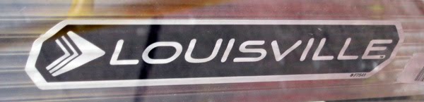
I don’t know when this rebranding happened. It’s possibly very old. Ladders don’t spoil, after all, and you see them at use every day throughout the city, so I just happened to find these two about a year apart.
The old logo has a perfectly serviceable bold italic serif thing going on. But the script L is a bit clumsy and mismatched. Also, it seems redundant to use the ladder icon, and the words “LADDER”. Just pick one.
All that said, the new logo is probably more flawed. The logotype feels pretty fresh, and more high-tech, which isn’t such a bad thing, but what’s with the undulating cap height? Then there’s the forgettable, virtually meaningless arrow-shaped logomark to puzzle on. And just for good measure, it feels a little too crammed into that holding shape.
I’m tempted to say it went from meh, to meh-er. Tell me what you think.
This week I’m going to try something new. I seem to have collected a number of pairings that illustrate rebrandings, but most of them don’t really qualify as Pr*tty or Sh*tty, so thus far I’ve had trouble finding a home for them.
Rebrandings are, of course, the domain of my good pals over at Brand New, but the pairings I’ll feature this week are either too old and/or too irrelevant to have been covered there, or on their B-Sides companion blog. So hopefully they won’t mind if a tread around the perimeter of their territory for a few days and go ahead and show them here.
I’ll offer up a few comments, but otherwise I’ll open the voting and let my exceptional readers decide whether the old or new identities are better.
Let’s get started.
Old:
New:
Even to a non-coffee-drinker like myself, the Eight O’Clock brand is highly recognizable, thanks in large part to the the handsome and distinct Bokar font designed by letterer extraordinaire Daniel Pelavin.
All-in-all, the rebranding is pretty decent, I think. The logotype lost some of its charm and distinctiveness, and the leaf-shaped apostrophe, and associated kerning, are pretty awful. But it could be a hell of a lot worse, and I think it feels more contemporary at the end of the day.
What do you think? Did it go from Eight O’Clock to Eight O’Schlock?
Be sure to check back in every day this week for more!
Thanks to P*S* Reader, iPhone user, and good friend Domenic Pagalilauan, for today’s thought-provoking pairing.
Be like Dom! Go here to learn more about contributing to the cause. And here to get the P*S* iPhone App.