
I’ve been a bit lax in my blogging this week, so there’s two posts today.

Pr*tty
A brilliant bit of bespoke type design that communicates effectively what this brand has to offer: Power. Tools.
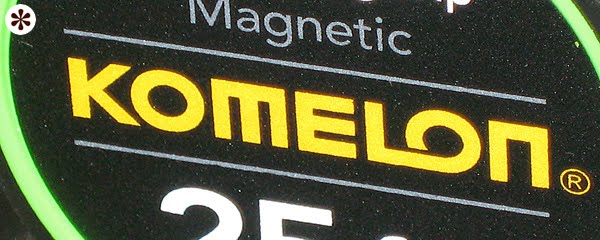
Sh*tty
Here the typography goes off the rails. It wants to be boxy and right-angle-geometric, but chickens out with the K and Os. I think that’s because, see, they want that second O to look like a tape measure, ’cause, get this, they make tape measures. Sadly, it looks about as much like a tape measure as the Staples staple looks like a staple.


That thing is supposed to be a *staple?!* HAHAHAHAHA!
ReplyDeleteNever knew that. Always just thought it was a weird choice. No I think it might be even more weird.
A staple. Ha!
Honestly, I thought the "Komelon" was trying to be a pun on "chameleon", and the "LO" was supposed to look like a tail....
ReplyDeleteIf you didn't tell me it was a tape measure brand, I would have never known