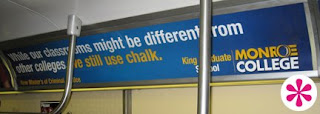
i think monroe's logo is awful.... while the script is almost witty, the logo is so bad that all i can envision is monroe muffler, logos and colors are almost the same... are the 2 affiliated?
and as far CUNY goes... i just think that their acronym is awful... its a battle they cant win... i mean, everytime i see or hear 'CUNY' i think it sounds sort of perverted. lol... plus i am just not a fan of generic faces in ads... stock boiler pics of target audiences. lame and unimaginiative.


hmmm.... i disagree, to me both are shitty...
ReplyDeletei think monroe's logo is awful.... while the script is almost witty, the logo is so bad that all i can envision is monroe muffler, logos and colors are almost the same... are the 2 affiliated?
and as far CUNY goes... i just think that their acronym is awful... its a battle they cant win... i mean, everytime i see or hear 'CUNY' i think it sounds sort of perverted. lol... plus i am just not a fan of generic faces in ads... stock boiler pics of target audiences. lame and unimaginiative.
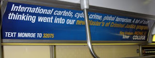
is that Steve Urkel on the far right on the CUNY ad? lol
ReplyDeleteThat totally looks like the "Arm Chair" guy (their graphic designer) from The Tonight Show with Conan O'Brian.
ReplyDeletePierre Bernard
ReplyDeletehttp://www.nbc.com/Late_Night_with_Conan_O%27Brien/images/videos/411x248/nbc_conan_032305_recliner_20060421_2255.jpg
LOL!
Great Blog, by the way. I will follow this one!