And so, I’ve reached a few conclusions: 1. It’s ok to not post everyday, as long as I try to post at least a couple times a week. 2. I need to be more flexible with the “a good thing and a bad thing” construct, which means sometimes I’ll just post a Pr*tty thing, or a Sh*tty thing by itself. And 3. I need to move the blog to another service, give it a refreshed design, and maybe succumb to allowing ads in the sidebar (some monetary motivation to keep the blog going wouldn’t hurt). But more on that third item in another post.
Now that that’s out of the way, let’s get down to some business: some custom type/lettering in logos.


Pr*tty
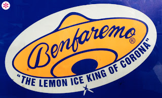
I find these two custom scripts all too charming. Mortite speaks nicely, albeit a little too literally, to their product line. And while Benfaremo could be better drawn, it feels organic and appropriate to the brand.
Sh*tty
Maybe I’ve been out of the game for too long, but I find myself with so little to say about these two abominations. The Heys logotype is simply inexplicable. Someone took the effort of drawing these characters from scratch? Or maybe they modified (for no good reason) some generic gothic typeface? The swash on the Y (formerly a V?) is an easy target, but it’s that S... that S! Face. Palm.
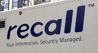
And then there’s Recall. I’ve been hoping to feature this logotype here for ages. Again, this thing is inexplicable. I think they had a grocery store cake decorator do it. And not a good grocery store. Like the one you only go to because it’s closer to your house than the one with the really good cheese counter. (It’s worth noting, this is far too reminiscent of the Coke Zero logo.)
And then there’s Recall. I’ve been hoping to feature this logotype here for ages. Again, this thing is inexplicable. I think they had a grocery store cake decorator do it. And not a good grocery store. Like the one you only go to because it’s closer to your house than the one with the really good cheese counter. (It’s worth noting, this is far too reminiscent of the Coke Zero logo.)


Refreshing as always. Welcome back
ReplyDeleteGood to new P*S post.
ReplyDeleteLooking forward to seeing all sorts of pretty and shitty things.
We've missed you.