

I’ll admit that this one is a bit out there. But it’s just bizarre enough for me to appreciate its irony (whether it’s intentional or not).
Since I don’t drink coffee, and know little about it, I tried to learn more about this coffee brand, and found this non-Select variety:

The design is not so good: the too-primary colors, the overly detailed drawing of El Exigente (i.e. The Demanding One). It lacks any of the retro charm of the Select logo. And that got me wondering if the Select logo was worth liking at all.
Further muddling the issue, another quick image search on line revealed a pretty nice older design for this brand’s packaging:
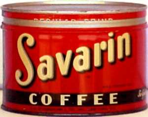
So nice, in fact, that I really began to question the Select design. I mean, why did they ever change it, for goodness sake!? Jasper Johns loved it, and that should be good enough:
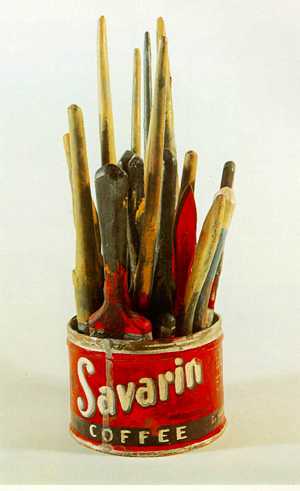
Oddly enough, this artwork has an interesting little story behind it. I encourage you to take a look... scroll to the bottom.


I was in the sh*tty camp even before seeing the awesome old packaging. There are bits that are nice-ish, but the sum of the parts equal poop
ReplyDeleteThe old one looks like a can of chewing tobacco...
ReplyDeleteI like the first and third examples enough that they cancel out the sh*tty one. More importantly, though...are a hat and mustache really all that stand between select and non-select?
ReplyDeleteGreat that you showed the link to the can designer!
ReplyDelete