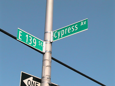

A P*S* Reader sent me these images from the Bronx. For most New Yorkers, the first image will look very familiar. The second image appears to be a new design for our fair city’s street signs. I’m pretty sure the typeface is a (sadly) compressed version of Clearview Hwy, the new official typeface for roadway signage, which makes sense.
Still, despite Clearview’s well-researched design and highly-sanctioned usage, the new design doesn’t sit quite right with me. It didn’t sit right with today’s contributor either. But it’s probably safe to say we’re only biased by our familiarity with the older design (an interesting phenomenon that might demand further commentary in another post). So, I’ll leave it up to the larger reading population, especially you non-NYers.
Thanks to Fernando Gil for the images.


I know that mixed case is easier to read, but I feel like the descenders mess everything up on signs like these. E 139 works okay, but "Cypress" feels like it's floating, just to make room for the lower portion of y and p.
ReplyDeletePrecisely! It's just awkward; all the letters ought to be the same height, as they are now. Besides, I've always found caps to be plenty easy to read.
Deleteyeah, it's not a question of the face for me. It's the capitalization.
ReplyDeleteI'm probably just too old school and crusty, but I think street signs should be set in all caps.
The new one is easier to read, but I agree that the mixed case also introduces some issues.
ReplyDeleteMy first reaction is that they need to make the signs taller in order to make room for there to be descenders, although I'm certain that's not an acceptable answer because of the additional expense it would incur.
Perhaps they could design a new typeface with more compact descenders that would allow them to keep the baseline a bit lower.
The alignment of the new one is all wrong, and everyone knows that all caps is better.
ReplyDelete